Analyzing a broken GPS watch with pandas
Published:
The GPS watch I bought last November was broken. Industry standard GPS watches make a recording once every second and log it to a .gpx file, but mine wasn’t doing that. Sometimes it was logging every second, sometimes it wasn’t. In this post, I explore and visualize the data logged by my failing GPS device.
A .gpx file is an xml file with entries formatted like the following.
  <trkpt lat="41.8001709" lon="-87.5809939">
    <ele>182</ele>
    <time>2022-01-06T18:30:03Z</time>
      <extensions>
          <heartrate>0</heartrate>
          <distance>1113</distance>
          <cadence>0</cadence>
      </extensions>
  </trkpt>
The first field is the recorded latitude and longitude. The <ele> field is elevation (in meters), <time> is the time of the recording, and so on. A functioning device with a good satellite connection records once per second, so if two consecutive entries differ by more than one second, there must have been some issue. For example:
<time>2022-01-06T18:30:14Z</time>...<time>2022-01-06T18:30:22Z</time>
for consecutive entries corresponds to an 8 second gap in recordings. There are two explanations for such a gap: poor satellite service or a malfunctioning device.
Exploring the raw data
My device was consistently giving poor readings, so I decided to analyze its .gpx logs to see if the watch was malfunctioning. The first thing I did was write a python script to extract the relevant data from the .gpx file and format it in a friendly .csv file. The code for this is on my github. Next, we’ll look at the data with pandas by importing with import pandas as pd. Now we run df = pd.read_csv("chi_gpx.csv") to store the data in a dataframe, and then examine it with df.head().

The python script that created the .csv helpfully computed the time gaps between readings, which are display in the ‘Time Delta’ column. More precisely, the value of ‘Time Delta’ gives the duration (in seconds) from the previous reading. We are interested in rows with gaps greater than one second. We can find these with gaps = df.loc[df['Time Delta'] > 1].
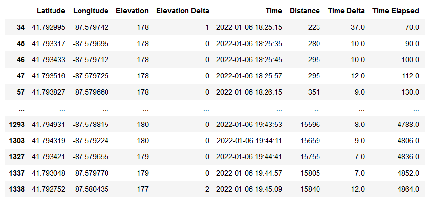
This is not good. For comparison, here’s the same data from a healthy device used on the same route:

Yes, a healthy GPS device had exactly one time gap, and it was 16 seconds long. We can compare with the worst time gap from the bad device with max(df['Time Delta']) which returns 216. That’s 3 minutes and 36 seconds with no GPS recordings!
Visualizing with a histogram
We can plot all the recording gaps in a histogram to get a better sense of their distribution.
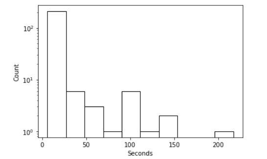
This was produced first by importing matplotlib import matplotlib.pyplot as plt, then the code
gaps['Time Delta'].plot(kind = 'hist',
                    log = True,
                    color = 'w',
                    edgecolor = 'k',
                    grid = False)
plt.xlabel('Seconds')
plt.ylabel('Count')
The reason for the log scale on the y-axis is because there’s a lot of short skips, and only a few very long ones.
Visualizing with a leaflet map
Another nice way to visualize the same data is to plot the gaps on a map. For this, I’ll use folium to plot everything. The logic I’ll follow is this:
- Connect consecutive recordings by a black line segment on the map. This will give a continuous black line showing the entirety of the recorded activity.
- Draw an orange line segment between two consecutive recording locations if the gap between readings was more than a second. That is, if the second reading appears in the
gapsdataframe.
First we import folium, then we create a map object m = folium.Map([df['Latitude'][0], df['Longitude'][0]],tiles="CartoDB positron", zoom_start=13). This makes an empty map centered at the latitude and longitude of the first recording in our dataframe df. Now we can run
pts = []
for i in range(1,len(df['Time Delta'])//2):
  pts.append([(df['Latitude'][i-1], df['Longitude'][i-1]),(df['Latitude'][i], df['Longitude'][i])])
folium.PolyLine(pts, color = 'black').add_to(m)
The reason for dividing len(df['Time Delta']) by 2 is that this recording is from an out-and-back run, so it covers the same ground twice. This would display two tracks in roughly the same place, so I’m ignoring the second half of the activity for the sake of clarity. Saving the map with m.save('chi.html') produces the following:
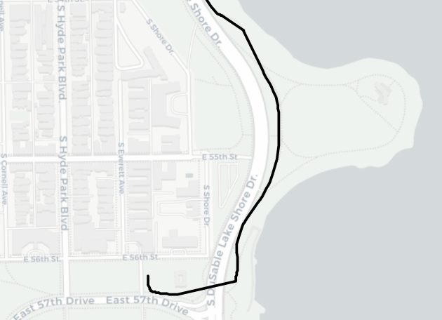
Now let’s create the orange line segments highlighting the GPS recording gaps.
pts = []
for i in range(len(df['Time Delta'])//2):
  if df['Time Delta'][i] > 1:
    pts.append([(df['Latitude'][i-1], df['Longitude'][i-1]),(df['Latitude'][i], df['Longitude'][i])])
folium.PolyLine(pts, color = 'orange').add_to(m)
Saving once again with m.save('chi.html'), we get the map:
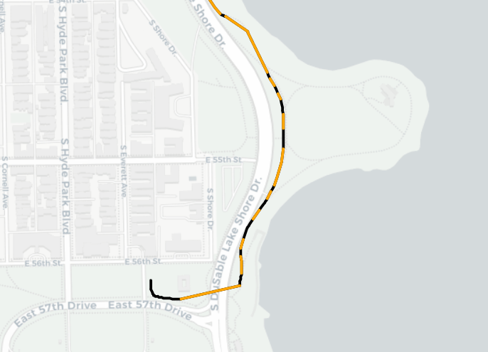
The orange segments highlight places where the watch failed to make a GPS recording. When showed on the map, they reflect the distance between recordings, rather than the time. A longer orange segment corresponds to a longer distance traveled between recordings. This shows roughly the same thing as the time between recordings assuming I was traveling at a consistent pace.
Just for the sake of comparison, let’s repeat this with our healthy GPS device on the same route:
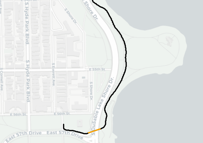
Note: the one (16 second) gap here is precisely where the route goes into an underpass.
